Stedelijk Museum Amsterdam
A grand old building and a futuristic new extension house one of Europe’s most prestigious modern and contemporary art collections.
Retaining and enhancing
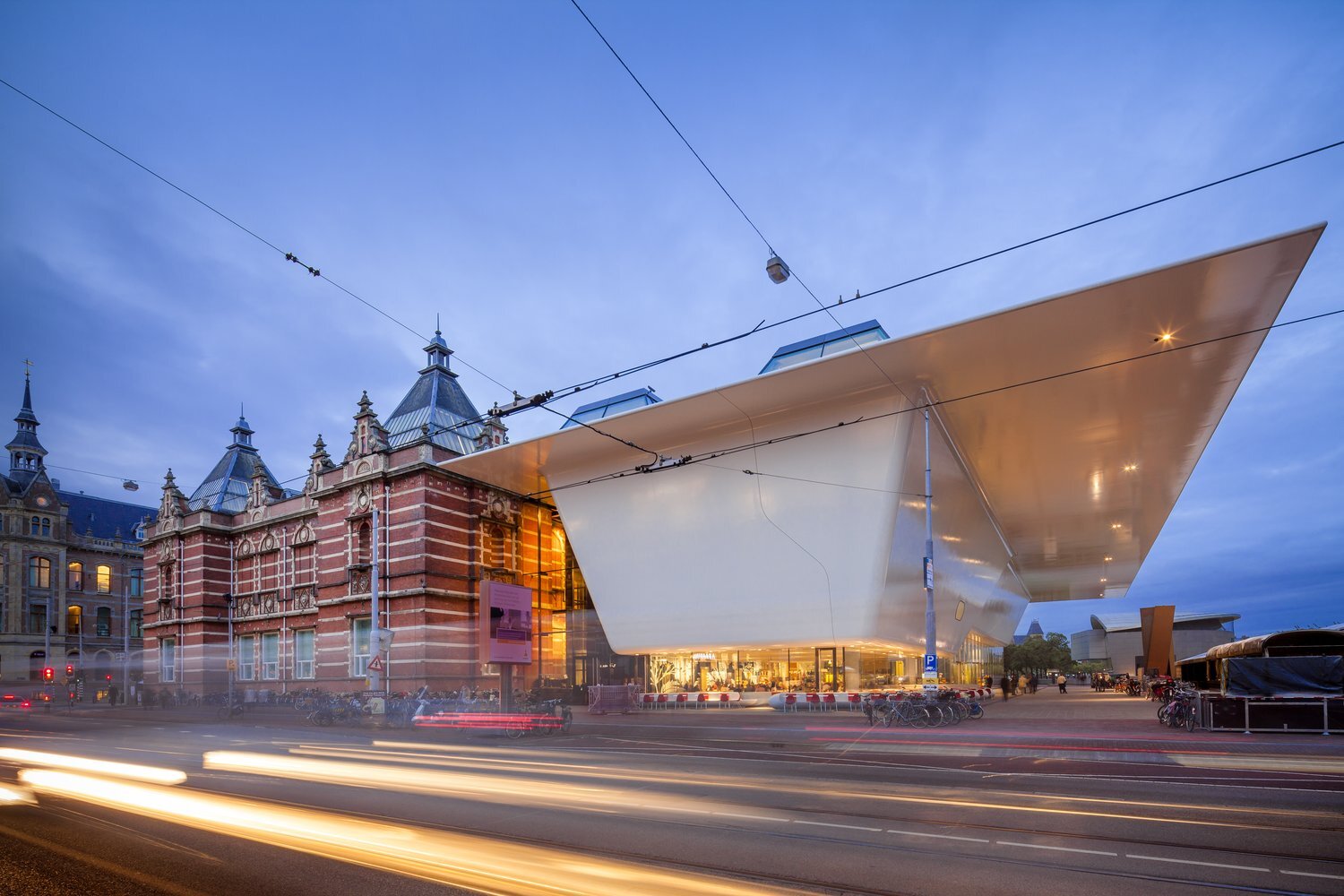
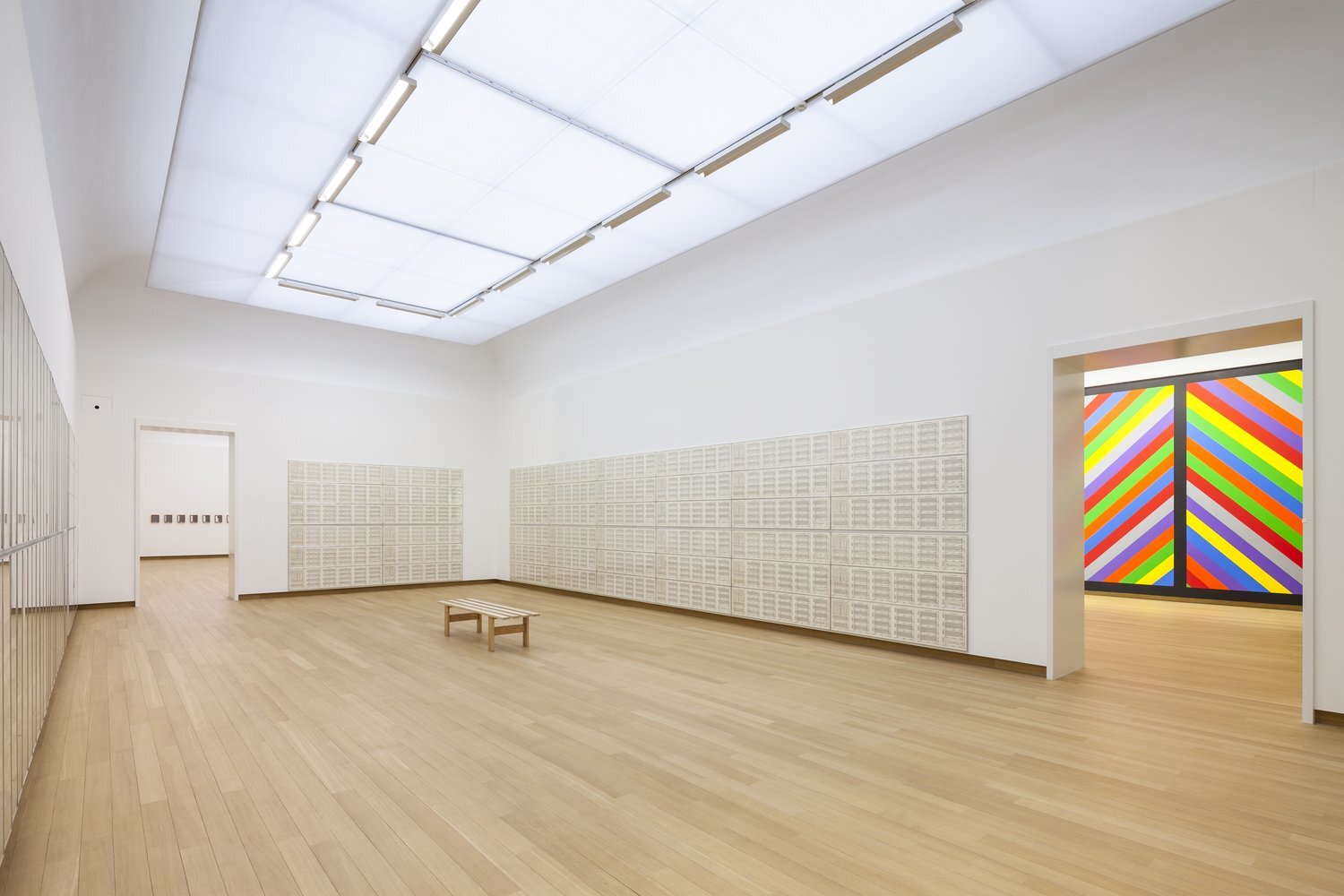
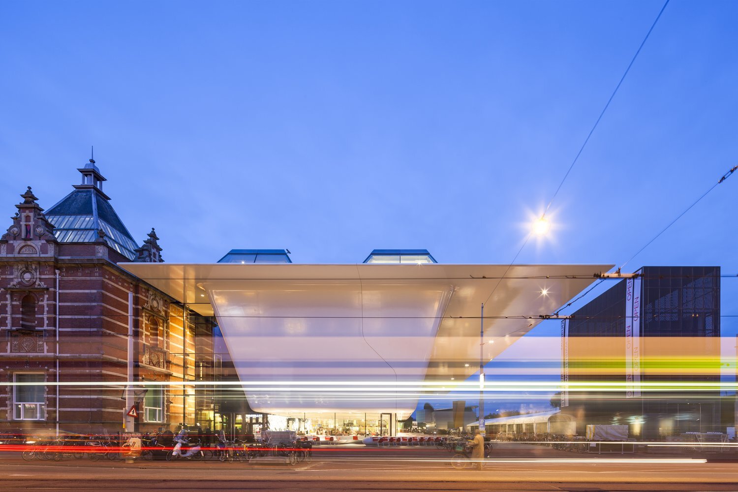
Amsterdam’s Stedelijk Museum has been renovated and enlarged. Originally designed by A.W. Weissman in 1895, the building has always been celebrated for its majestic staircase, grand rooms and natural lighting. These strong points have been retained in the new design, along with the colour white that was introduced in 1938 throughout the museum by former director Willem Sandberg.
Refreshing the museum with a bathtub
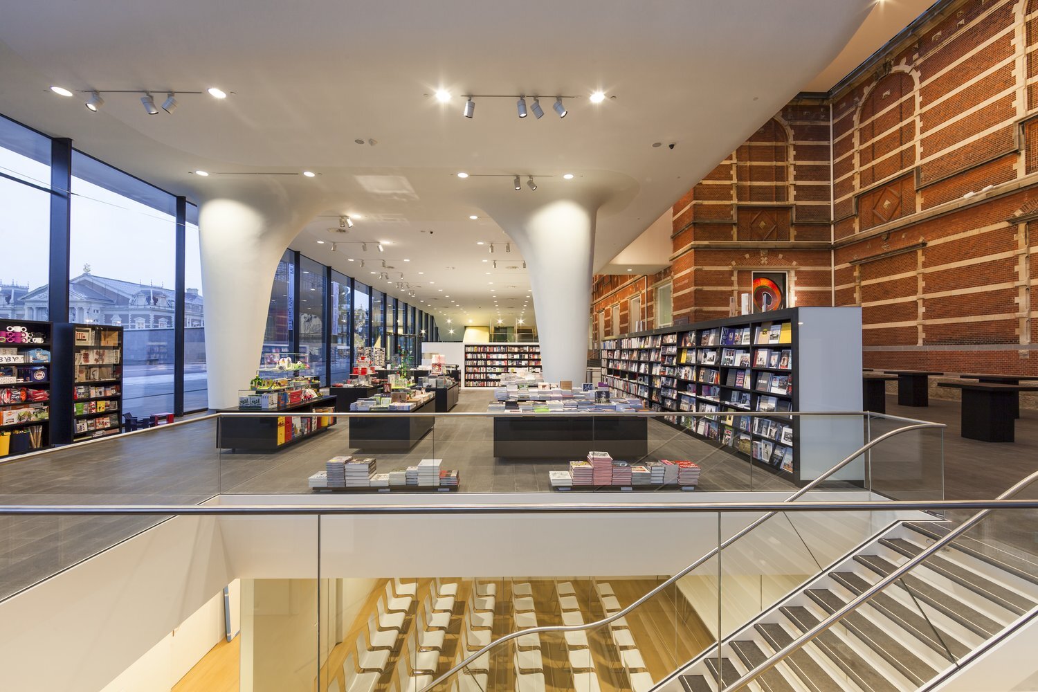
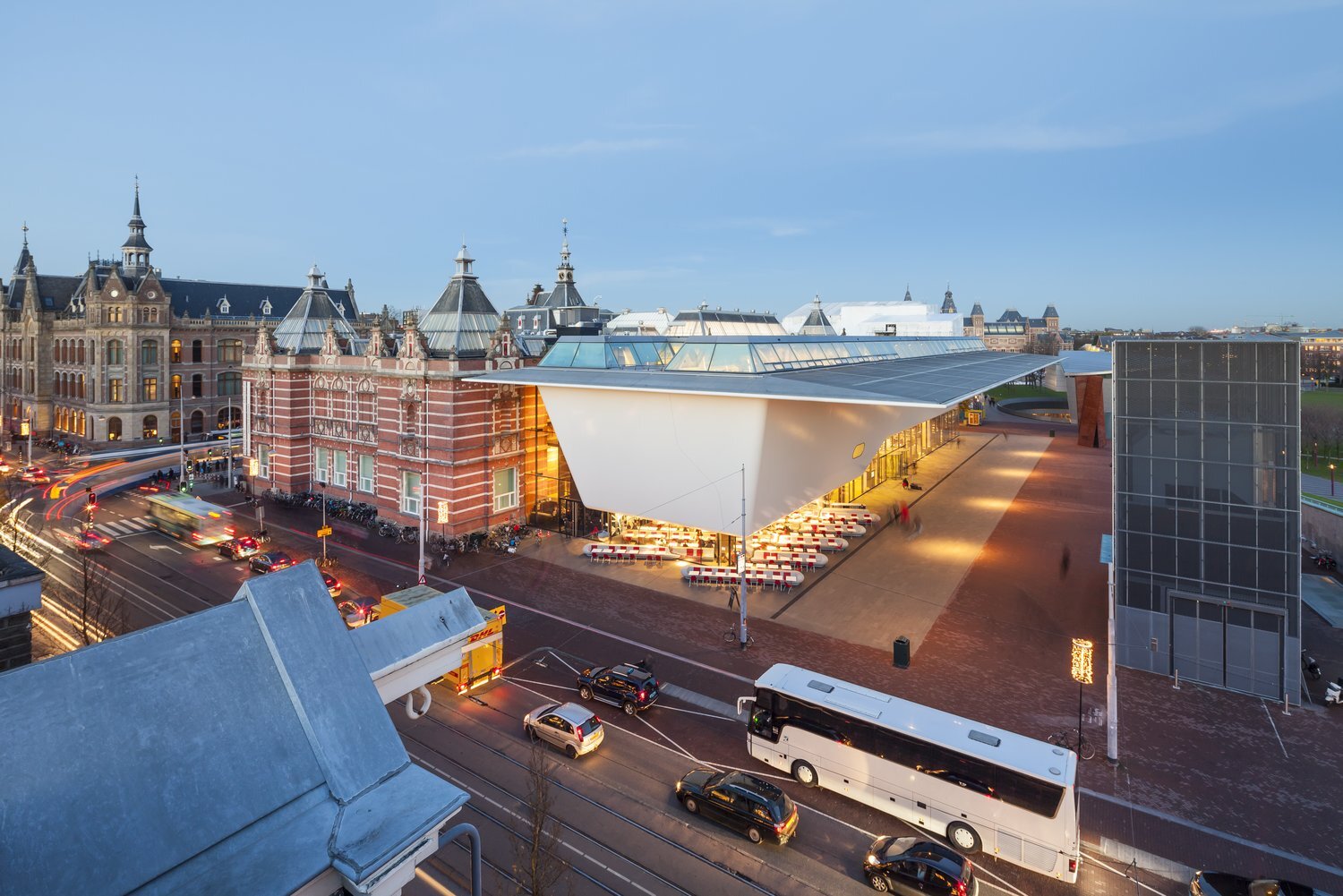
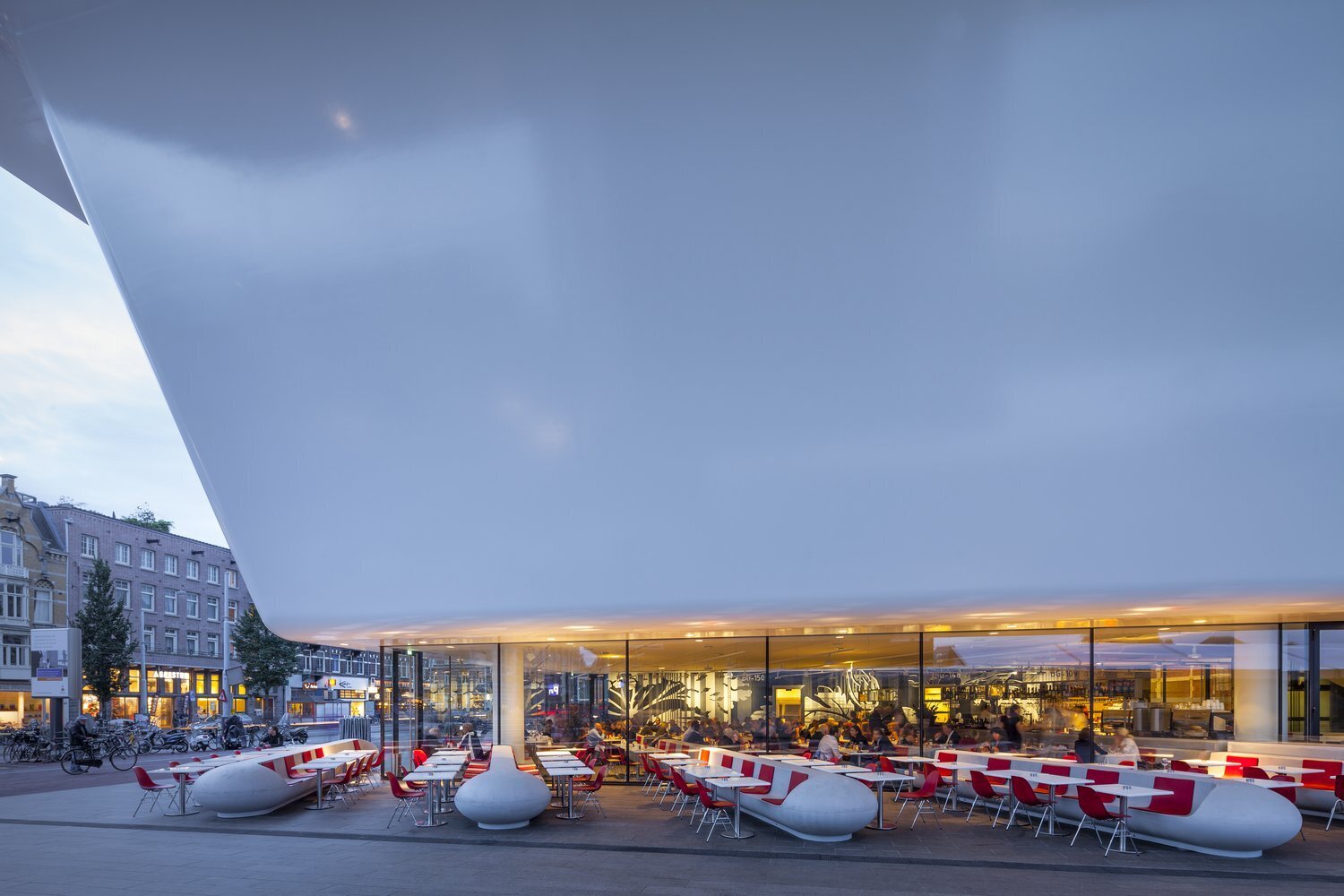
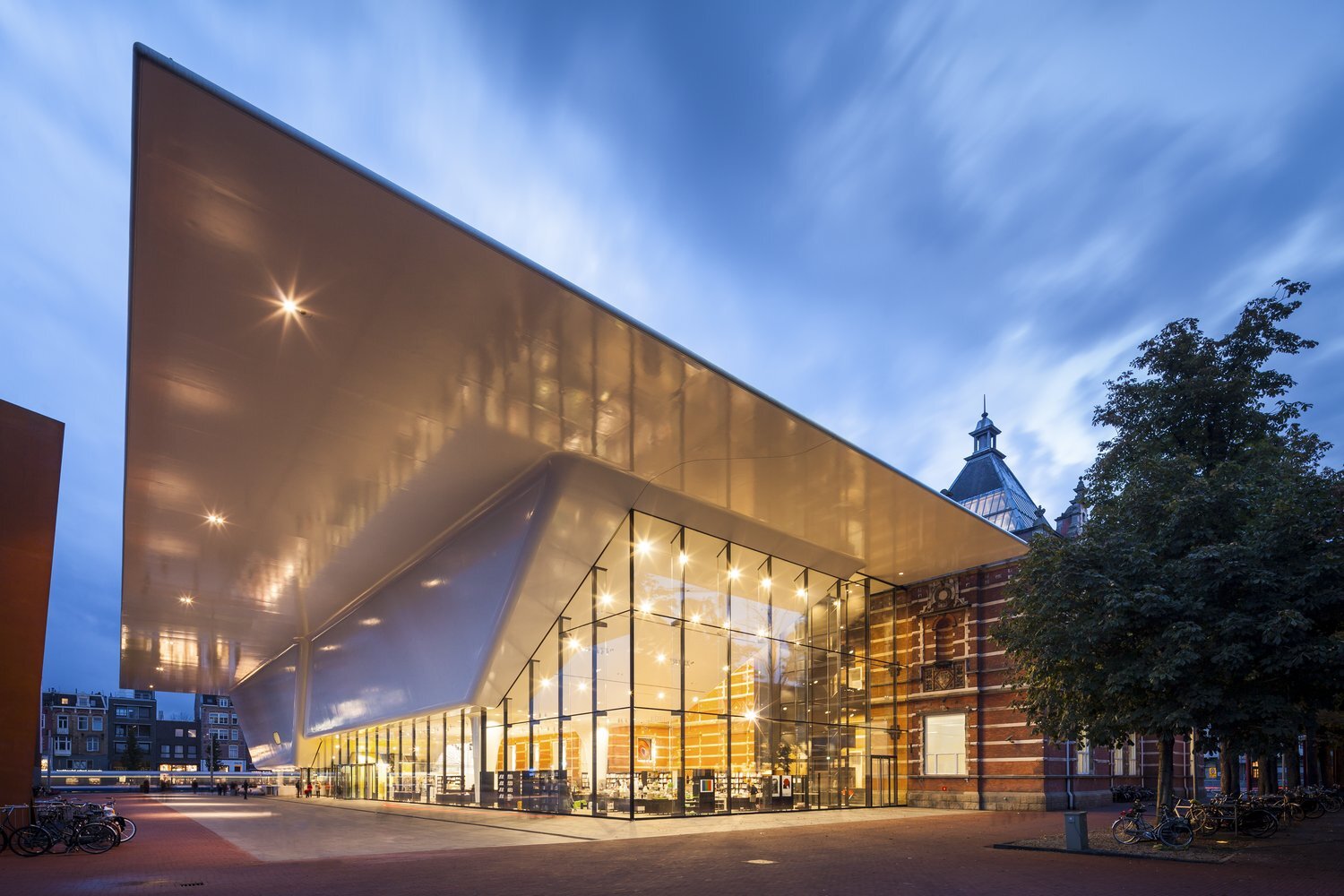
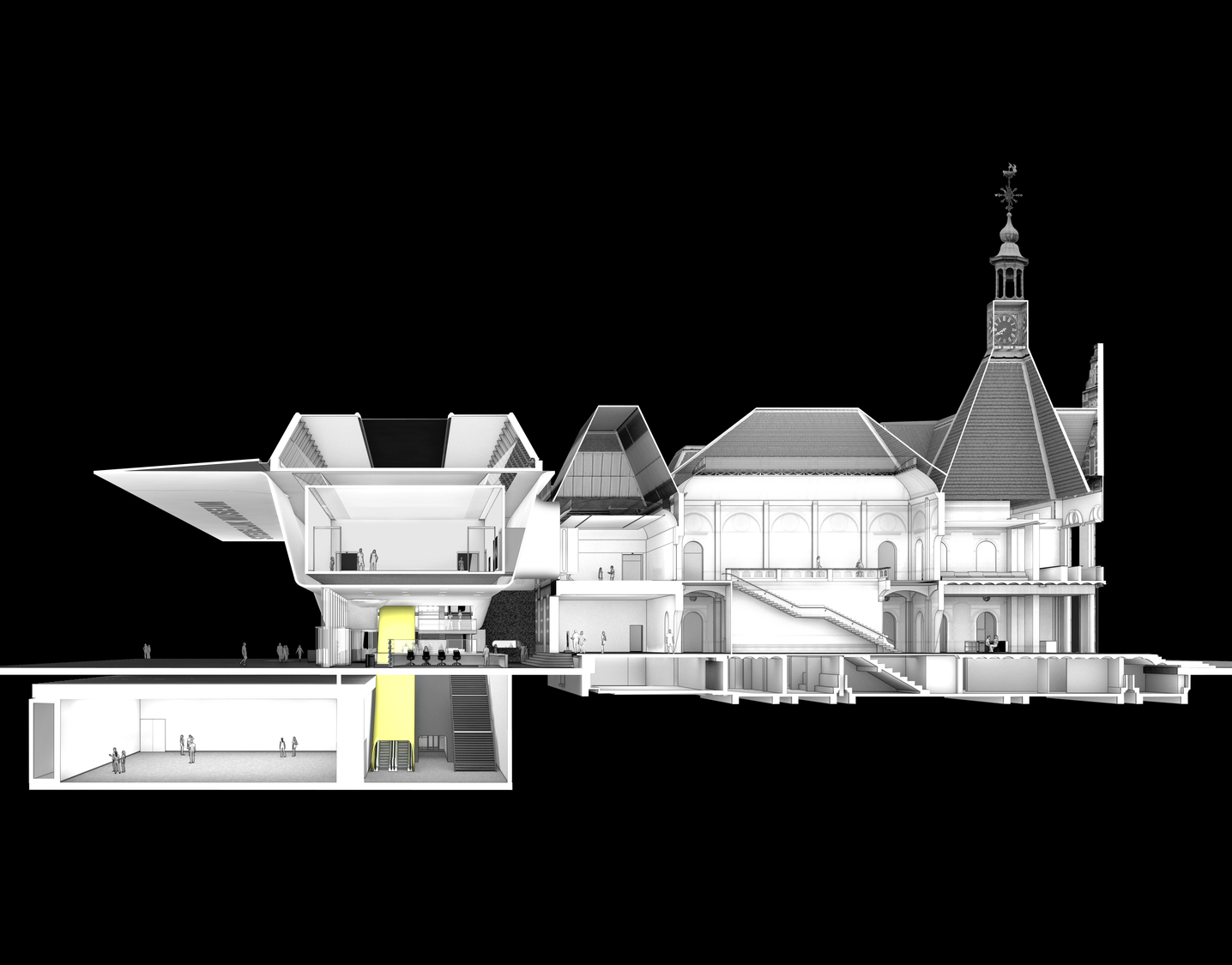
By lifting part of the new volume above ground and sinking the rest underground, the existing building is left almost entirely intact and in full view. The entrance was moved to the spacious and transparent extension on the side of Museumplein, contributing to the new public quality of the square. The glossy, smooth white volume above the entrance, also known as ‘the Bathtub’ because of its shape, has a seamless construction of reinforced fiber and a large canopy hovering over the square, creating a roofed plaza that belongs as much to the building as to Museumplein. Against the backdrop of the historical building, the white synthetic volume is the new powerful image of the Stedelijk Museum.
New and old aligned
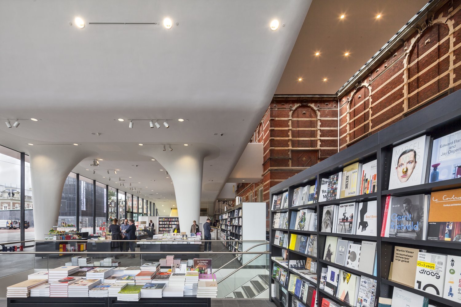
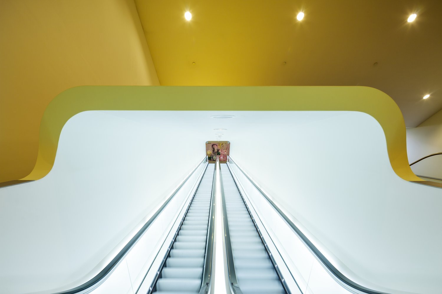
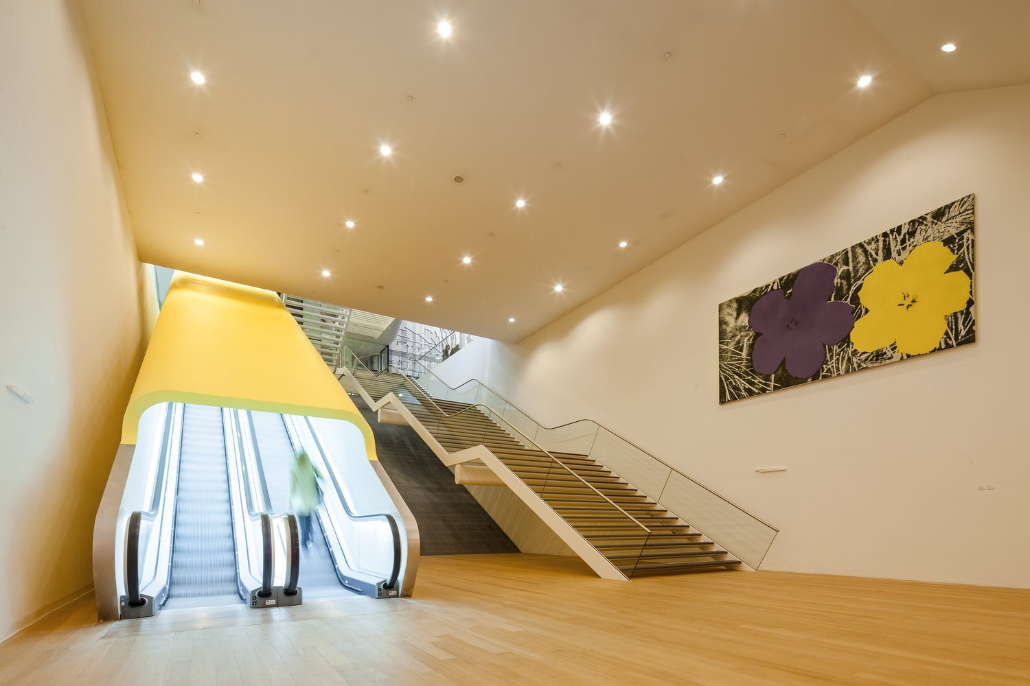
The detailing and color on the inside of the old and new buildings are in alignment, making the explicit contrast of the two exteriors barely noticeable for visitors touring the museum. The Weissman building is reinstated in its former glory, and with the modern and spacious extension, now creates a new Stedelijk Museum that is ready for the future.
—
