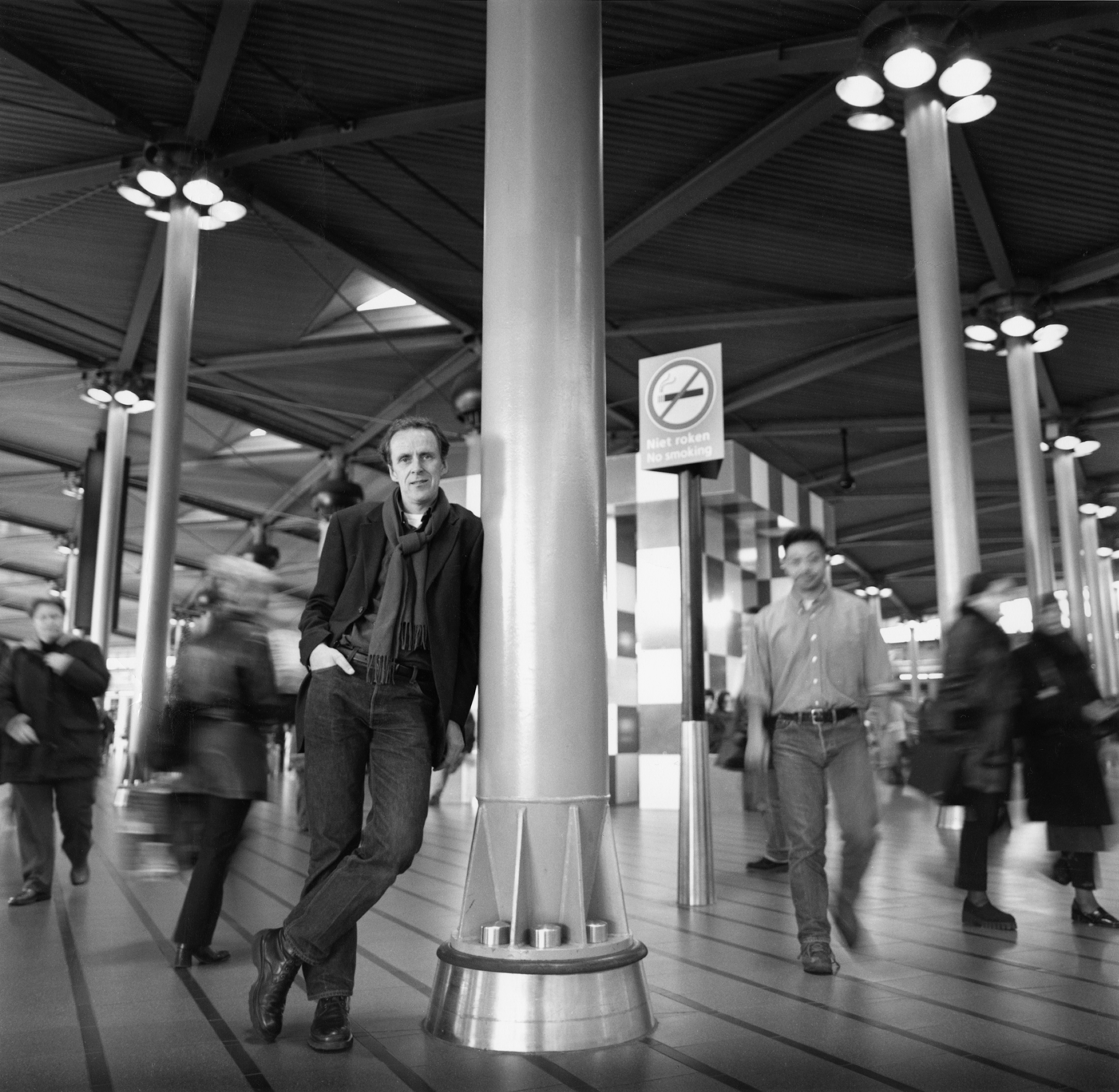
Jan Benthem tells the story of the North-South Metro Line
HOW IT BEGAN
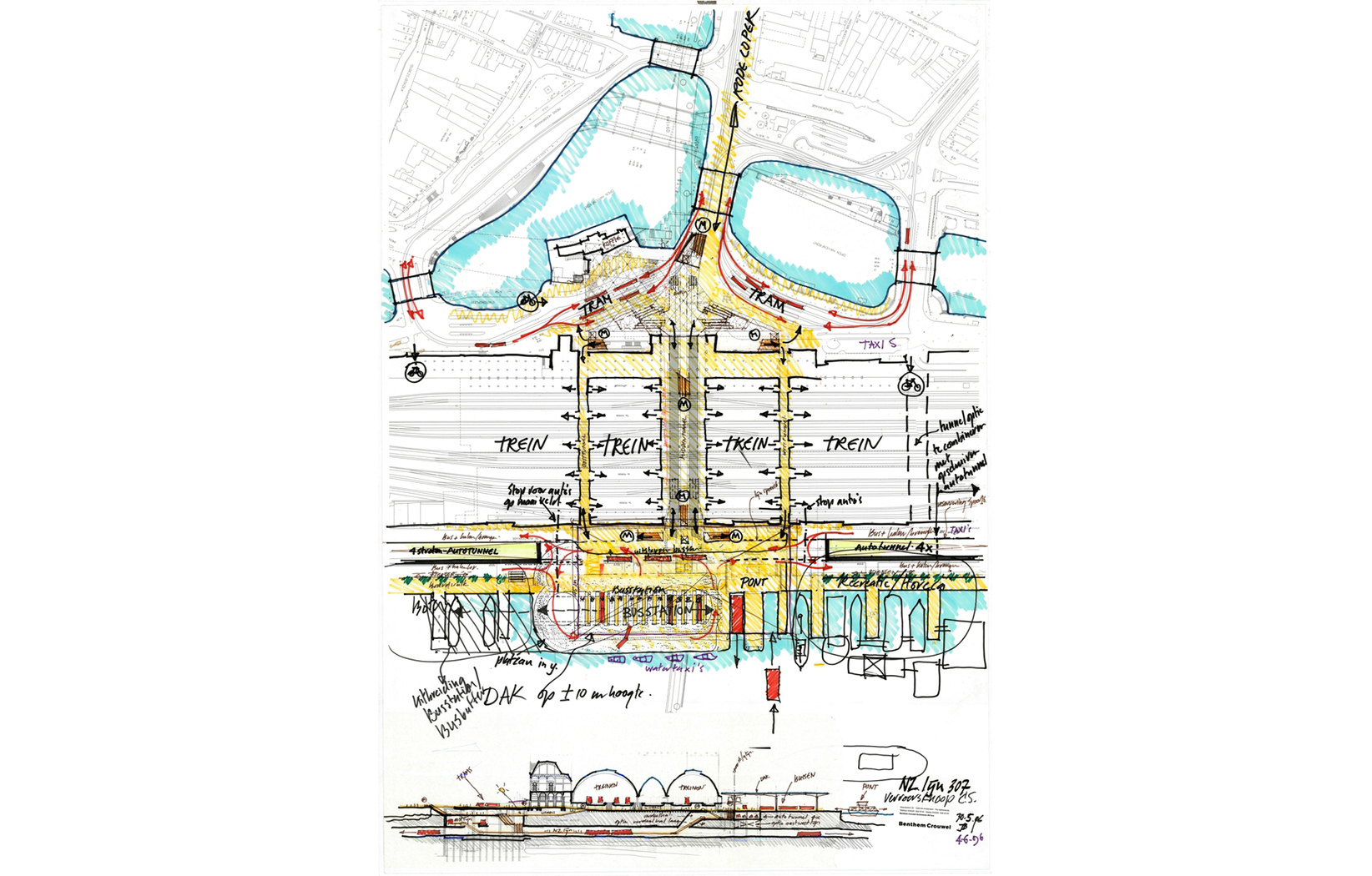
In 1995, we were extremely busy. For 7 years, we had worked on the Schiphol Airport expansion with me as a leading architect. We were tired. When the Municipality of Amsterdam asked me and Mels Crouwel to present a vision for the architecture of the new North-South line, we simply did not have time to create a detailed proposal. So we just made one drawing and presented a couple of slides to the committee. It wasn’t a very polished presentation, we dropped the projector slides and they got mixed up. But we made our point. Our vision was to create stations that were not underground spaces separate from the city, but spaces that would function as a continuation of the public domain. After the meeting we said to each other: “Maybe it worked…” A week later, we got the call.
INSPIRATION
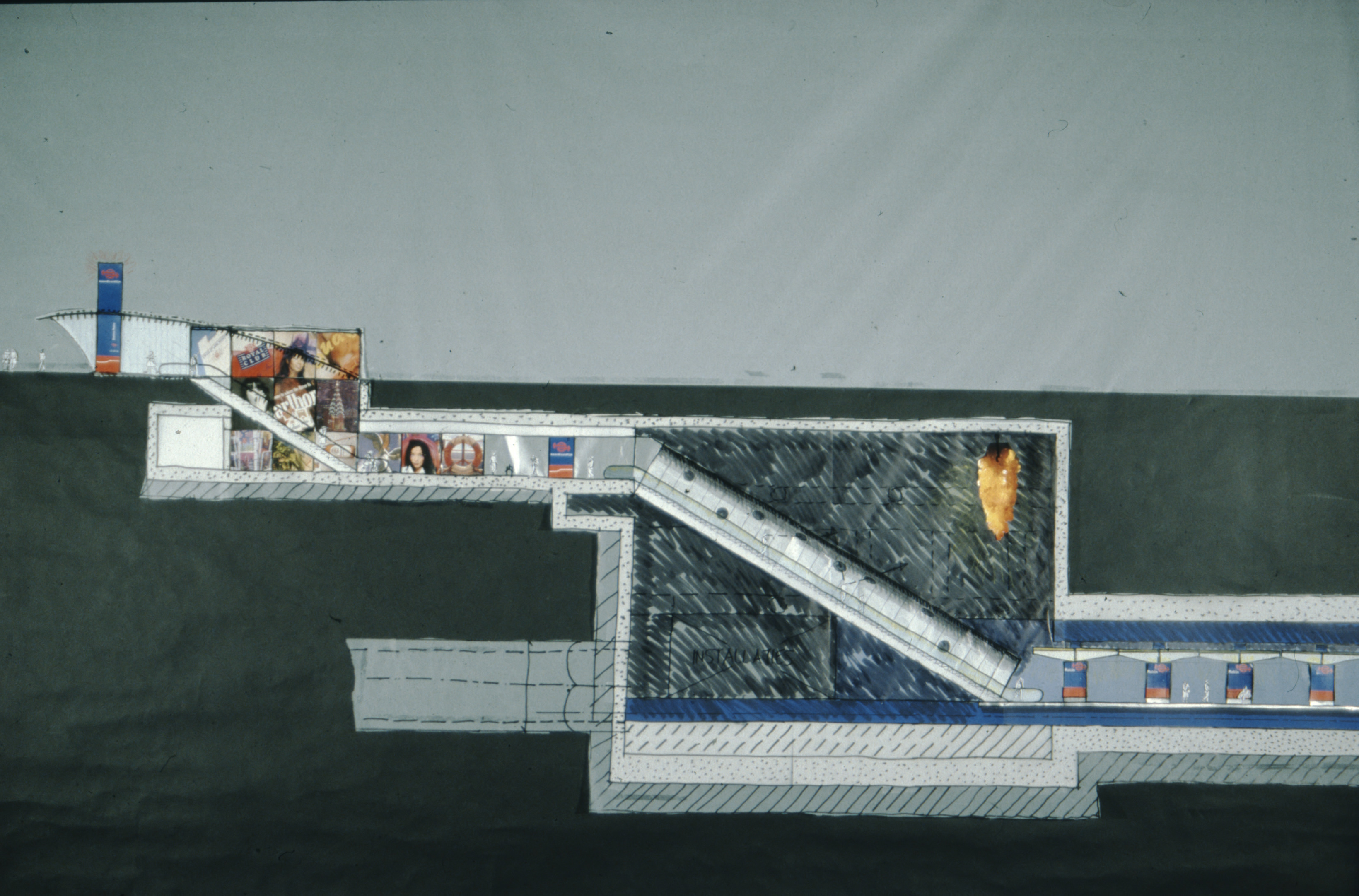
I had just seen an artwork by Dale Chihuly: a 20 meter long, very narrow swimming pool in a dark room, illuminated by art lying on the bottom of the pool. The effect of art in a dark and confined space, creating something light and bright where you don’t expect it, was a major inspiration for the North-South Line stations.
We had a very strict brief. Stay underground, do not change the urban environment above ground or demolish any buildings.
CONVINCING THE AUTHORITIES
We had a very strict brief. Stay underground, do not change the urban environment above ground or demolish any buildings. While esthetics were part of the reason, the trauma of the construction of the Eastern Metro line in the 1970’s (where the demolishing of old buildings had caused public uproar) was still very much in everyone’s memory, and the authorities did not want a metro interfering with the city. We wanted to respect this, but also realized that these were stations for the future, for the public, to improve the city. That’s why we proposed to tear down a building that was actually part of the Eastern line (a concrete control post right in front of Central Station). There was no resistance to removing this reminder, and it opened the discussion for more interventions that have greatly improved the Central Station area. The plan for the Central Station area was literally drawn up in a couple of hours. After a working visit to the Paris metro together with municipal authorities, we got stuck on the train back to Amsterdam and just started talking and drawing.
A COMPLICATED PROCESS
What complicates a long-term project like this is not only the design or technical difficulties: it is how to navigate the numerous political sensitivities and dilemmas. Of course, hiccups and delays in projects of such a scale will happen – but you cannot look at them as disasters. They are part of the project, you just keep working, with determination, and stand behind your project.
Most stations ended up just the way we envisioned them.
A DILEMMA IN DE PIJP
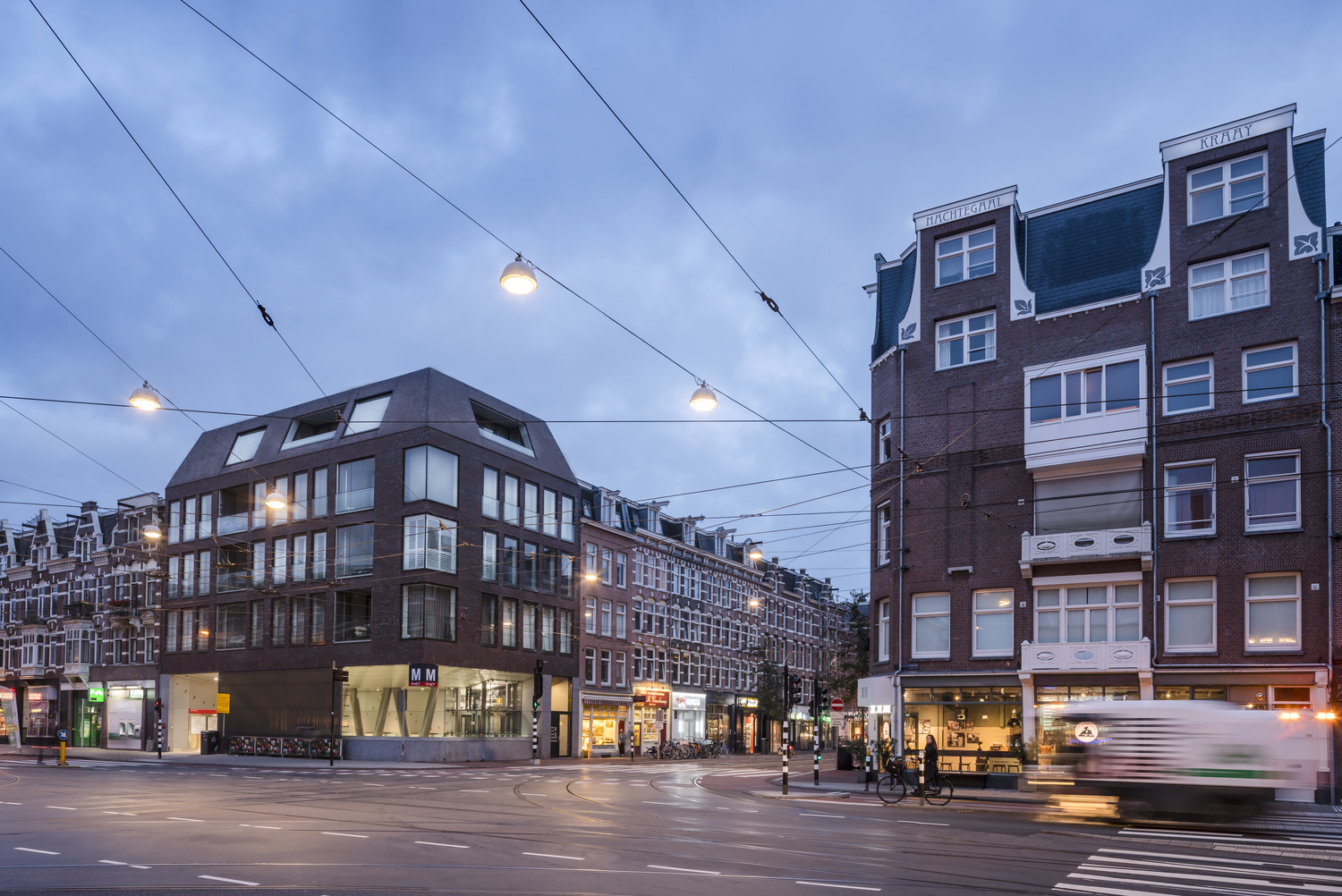
The station in the Amsterdam neighborhood De Pijp had to be built in a very narrow street, so an entrance here was only possible if it became a pedestrian area. That was not an option at the time, but we were allowed to make entrances on the ground floor of 2 new corner buildings. Our designs for these buildings were turned down by the Municipality with the explanation that our work was too modern, and that they preferred a firm like the one that renovated the Anne Frank House, unwittingly putting themselves in a very awkward position because that project was ours! We never said anything and just accepted the fact we would not design those buildings. Years later, we found a developer and built the corner buildings anyway – and the street became car-free after all.
PROUD
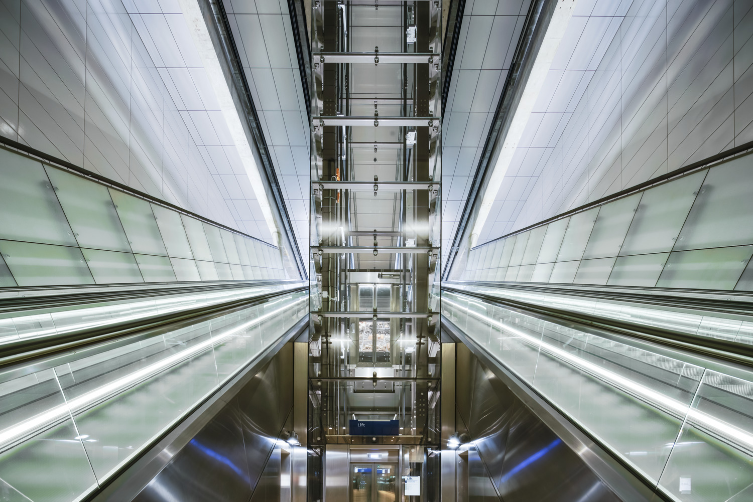
The end result is something to be proud of. We are very happy that the stations we worked on for so long are now being used, and that the people of Amsterdam are proud of them too. We designed all stations as part of the public realm, but only now that people are actually travelling on the metro have these stations become public.
Most stations ended up just the way we envisioned them, no small feat considering the fact we started designing more than two decades ago. Some of them turned out even better than we thought, like Europaplein. It’s the least deep station, in an area far from the center and very simple, more simple even than we imagined. But it’s a spectacular simplicity that delivers a message: this is the kind of work we do really well and are famous for.
